Want to guess how much of our website and blog traffic came from mobile last year?
43%
Before and after:
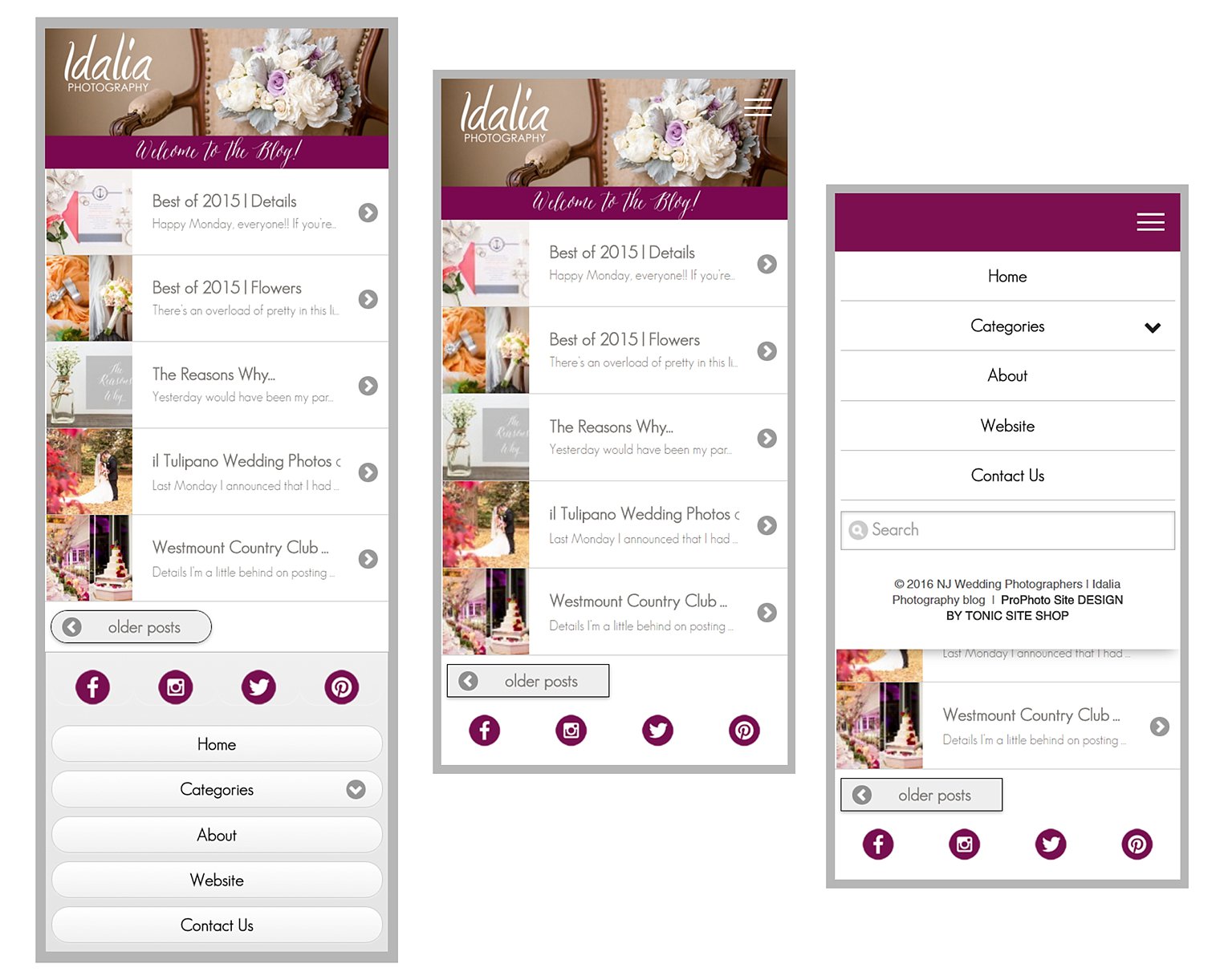
1.Responsive Menu Icon | Hamburger Menu
Above, on the left, is our blog before the responsive menu icon was installed. You’ll notice that in order to reach the menu, you had to scroll to the footer. Now, you can click right on the “hamburger menu” icon on the top right of the screen and the menu of options will appear.
2. Clean Menu
On the left, you’ll notice that the blog menu in the footer contained the standard ProPhoto design. It was fine, but with so many ProPhoto mobile sites out there, it certainly wasn’t unique. With the “clean menu” option, the appearance of the menu on our blog is now more in line with the modern look of our website.
3. Social Media Icons
It’s hard to believe but the Prophoto mobile version doesn’t offer social media icons! Photographers need to stay connected. Being active on social media shows potential clients that you’re open for business and keeps them updated on everything going on with your business. But you have to make it easy for them to find you! It’s a small change, but it’s an important one. We now have our social media icons pointing to our Facebook, Instagram, Twitter, and Pinterest pages at the bottom of our mobile site.
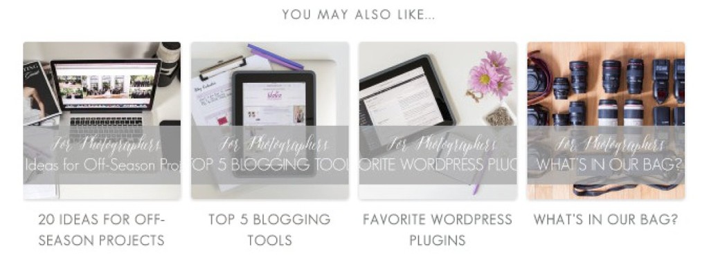
4. Customization of Related Posts Plugin
For those of you who use the Related Posts plugin, you’ll be happy to know that you can customize the font in the titles that appear below each image! Non-customized, the titles will appear in the same color/font you have selected for the rest of the links that appear on your site, but a customization allows you to choose something completely different! Here is what ours looks like:
5. Web Font Optimization
Do the fonts on your site look pixelated? If so, you might have fonts on your site that are not optimized for web. When we launched our new website last year, we adopted two new fonts as part of our branding. Our Showit website displayed our fonts beautifully, but our Prophoto blog was making them look pixelated and the letters weren’t uniform in size. Luckily, Viktor was able to optimize the fonts for web. See the before and after below:
And there you have it! For more information on the customizations that are available for ProPhoto sites, please contact creative-resort. Thank you for reading today and have fun dreaming up new ProPhoto customizations!
Looking for more posts like this one? Check out our page FOR PHOTOGRAPHERS.
